Categories
Things we like Work

Wilde beauty

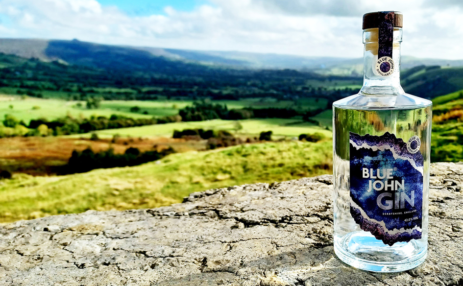
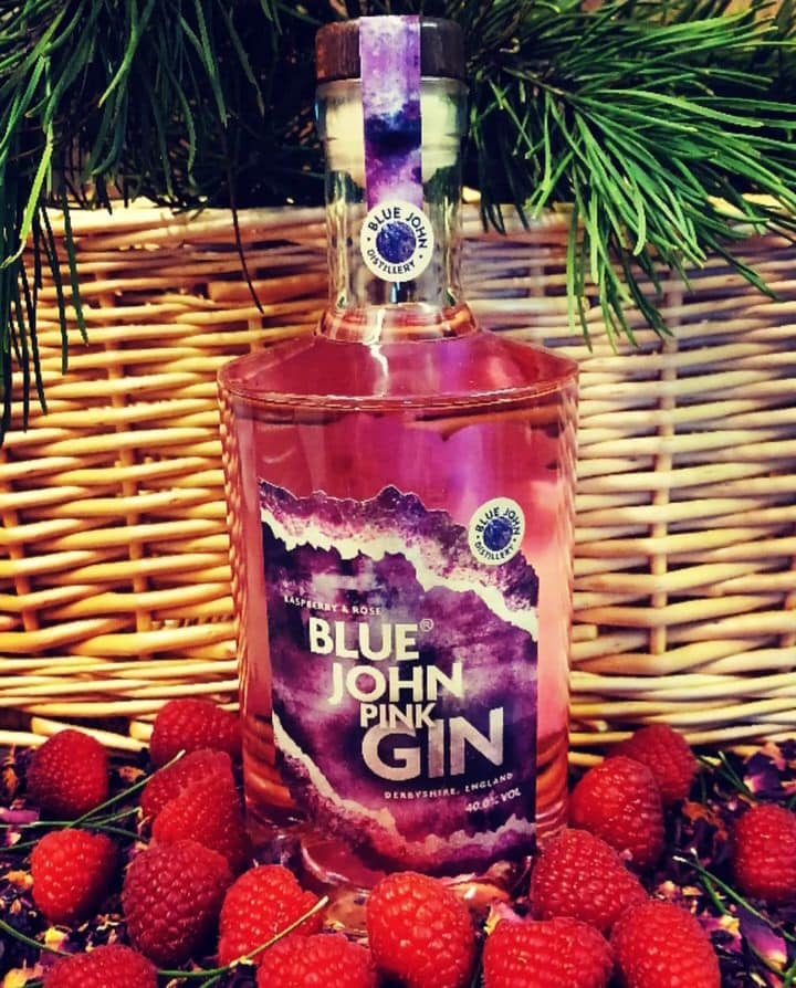
Michael Wilde’s Award winning Blue John hand crafted gin. Distilled using locally foraged and classic botanicals capturing the rarity of Blue John and the wild beauty of Derbyshire.

Our metallic label captures the spirit of this beautiful and rare semi precious mineral, found in the high and wild part of the Dark Peak District.

Blue John is a form of fluorite, with bands of blue, purple, white and yellow colours. It is Britain’s rarest mineral, first discovered at Castleton by the Romans almost 2000 years ago. During the 19th century, it was mined for its value as a beautiful and rare stone, with mining continuing on a small, carefully managed, scale today.

…Oh – and it makes for a cracking G&T..!

Categories
Things we like

Timeless.

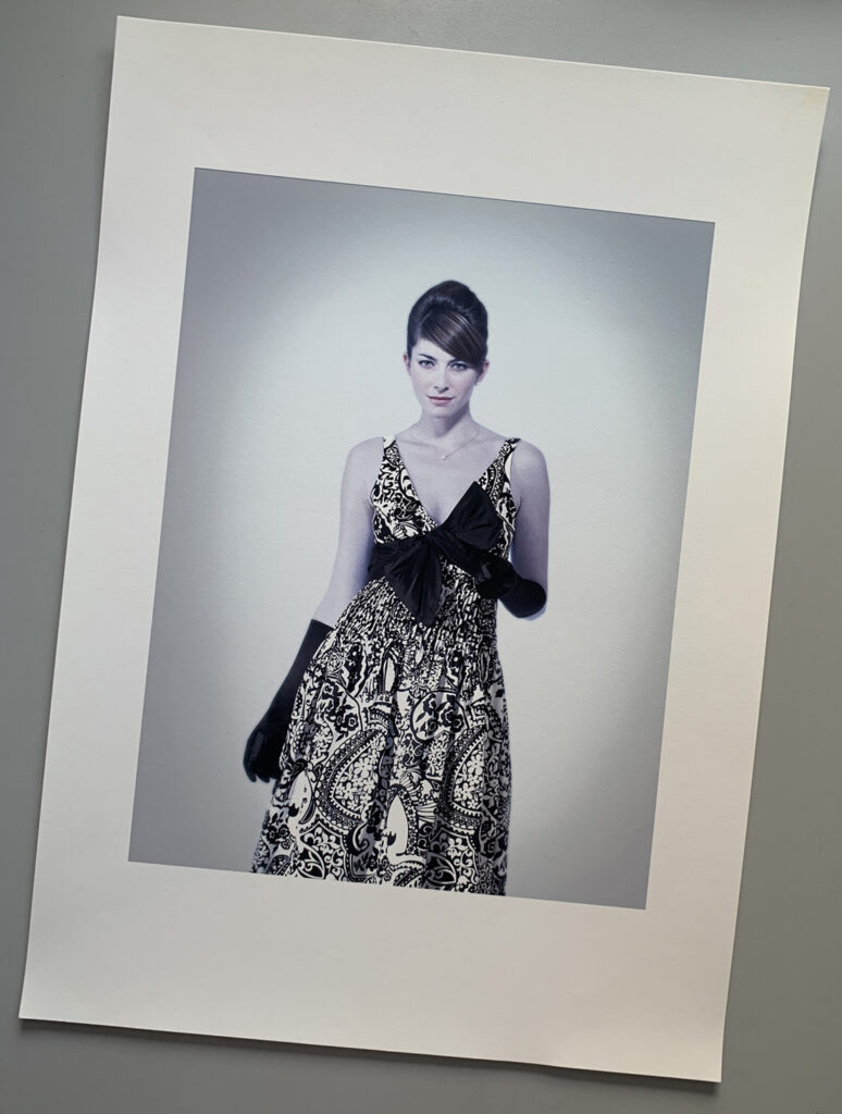
Came across some lovely prints recently of a fashion shoot we did for Emma Somerset. Thinking of all the great skill sets that go into fashion photography…

Casting, models, hair and make up, merchandising, art direction, and oh yes, let’s hear it for the shooter. The one who has to pull it all together and deliver. On time, on budget and on brief… Bravo!

But the hardest job of all – how to choose the right photographer..?

We do that.

Categories
Things we like

Quirky but cool…

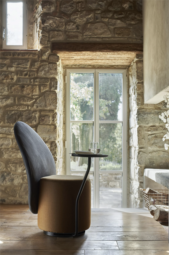
We love a bit of great Italian design… Italian designer Lapo Ciatti has created the Loomi Armchair for Opinion Ciatti as an “independent and functional microcosm”

The Loomi chair has a plump padded seat and wide backrest, designed to offer both privacy and comfort.

Opinion Ciatti’s Loomi chair

The chair can also be accessorised with a 180-degree swivel table for holding laptops, books and tablets.

“The optional swivel table turns it effortlessly into an independent and functional microcosm. An island ready for use that keeps up with our contemporary lifestyle, where the fluidity of space and time is paramount,” Opinion Ciatti explained.

Don’t know about that – but I’d still have one.

Long live Italian design.

Product: Loomi armchair
Designer: Lapo Ciatti
Brand: 
Opinion Ciatti
Contact: 
[email protected]

Categories
Things we like

Design and beer – two of our favourite things…

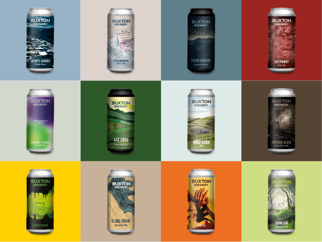
We’re delighted to say that since the beginning of 2020, IWP has been busy working with world famous Buxton Brewery and Distillery. The brewery is consistently voted onto the world’s top 100 brewers list.

All of the beers the brewery produces are designed to delight the senses and enthral the drinker. The can designs follow this principal, reflecting the connection to the surrounding National Park which dominates the landscape around the brewery.

If you can, visit the Buxton Brewery Tap House for outstanding flavourful beers (and pick up some beautifully designed cans). If not order online from buxtonbrewery.co.uk.

Cheers!

Categories
Things we like

IWP Font Of The Week

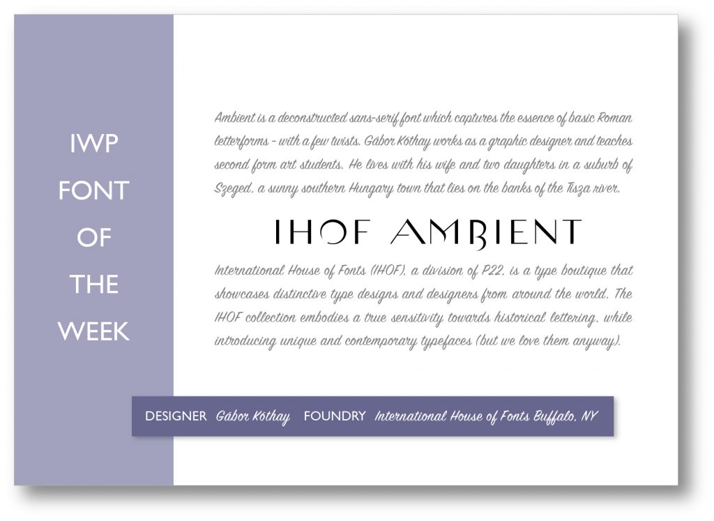
IHOF Ambient – Clean and simple sans with a pleasing embellishment. Has a flavour of the influential LETRAGRAPHICA fonts (more of this in a future blog).

Letragraphica

These fonts were brought out in the mid 70’s by Derek Birdsall, Roger Excoffon, Colin Forbes, Armin Hofmann, Herb Lubalin, Marcello Minale and Lou Dorfsman – top design gurus at the time. This went some way towards satisfying the desire for more expressive letterforms by designers keen to exercise their creative flair…

Categories
Comment Things we like

IWP Font Of The Week


Classic, elegant and expensive looking…IWP font of the week 3
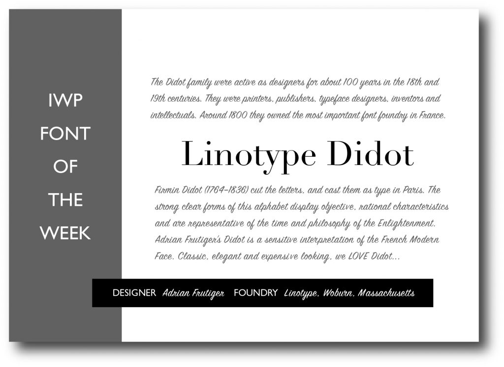
This is what lovely Wikipedia has to say…

 Didot is a group of typefaces named after the famous French printing and type producing Didot family.[1] The classification is known as modern, or Didone.

Didot’s type in the Code civil des Français, printed by the company of Firmin Didot in 1804.

The most famous Didot typefaces were developed in the period 1784–1811. Firmin Didot (1764–1836) cut the letters, and cast them as type in Paris. His brother, Pierre Didot (1760–1853) used the types in printing. His edition of La Henriade by Voltaire in 1818 is considered his masterwork. The typeface takes inspiration from John Baskerville’s experimentation with increasing stroke contrast and a more condensed armature. The Didot family’s development of a high contrast typeface with an increased stress is contemporary to similar faces developed by Giambattista Bodoni in Italy.

Didot is described as neoclassical, and evocative of the Age of Enlightenment. The Didot family were among the first to set up a printing press in the newly independent Greece, and typefaces in the style of Didot have remained popular in Greek since.

The Style Network used a bold weight of Didot in its on-air identity (in addition to the News Gothic font). Alexey Brodovitch implemented the usage of Didot in Cahiers d’Art and Harper’s Bazaar. Vogue has been using Didot as the typeface for their cover title since 1955.

A survey of 368 people done by writer and typographer Sarah Hyndman suggested that bold typefaces with rounder terminals appear cheaper, whereas lighter weights, serifs, and contrasts were rated as more expensive, with the modern Didot selected as the most expensive looking font.

The “CBS Didot” version of Didot was commissioned and used by broadcast network CBS for many years alongside its famous “eye” logo. While the network’s use of Didot with its logo is not as prevalent as it once was, it is still a common sight, used mainly for the imaging of CBS News, the logo for CBS Corporation, and the logotype for The Late Show with Stephen Colbert. It is also used as the logotype for the credits of the CBS sitcom “Mom.”
Categories
Comment Things we like

IWP Font of the week

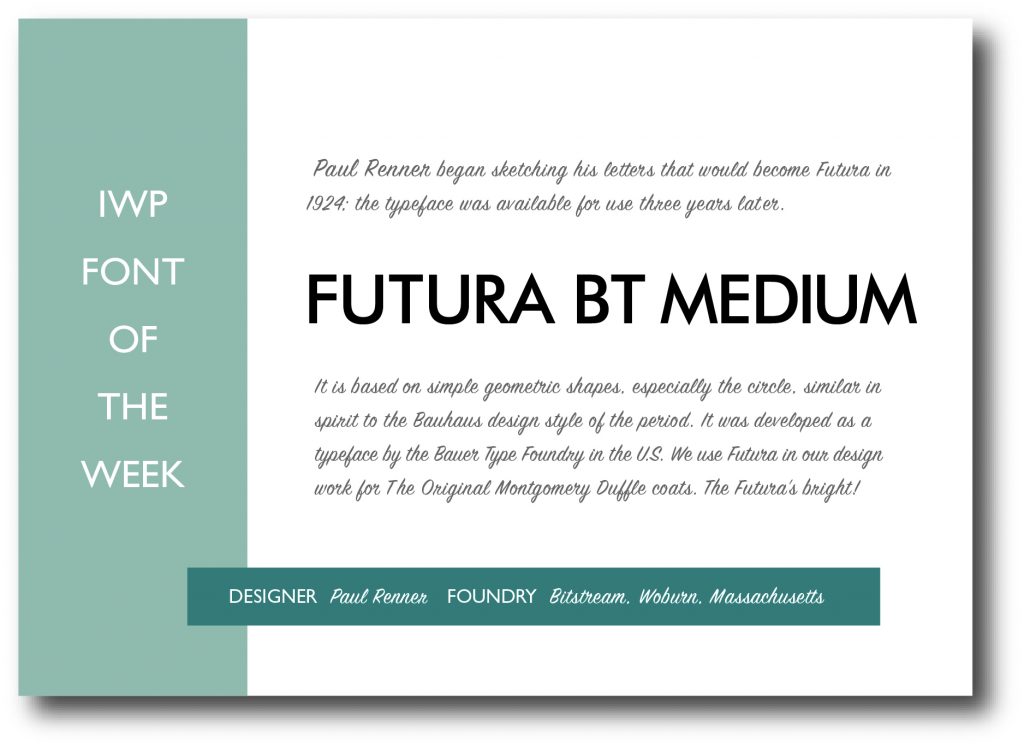
The Futura’s bright…


Categories
Comment Things we like

IWP Font Of The Week

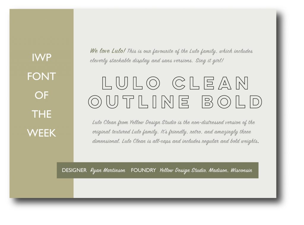
We LOVE how a font can work to deliver creative. So we thought we’d share the love…  The right font can help deliver quality and character before a word has been read. Why not see what we can do for you?

Power of fonts harnessed by IWP

From a quick refresh to a hard-working, fully loaded digital campaign. We’ve got the moves… and the fonts…  

Categories
Things we like

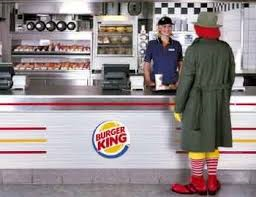
LOVE this…

burger king 2

Categories
Things we like

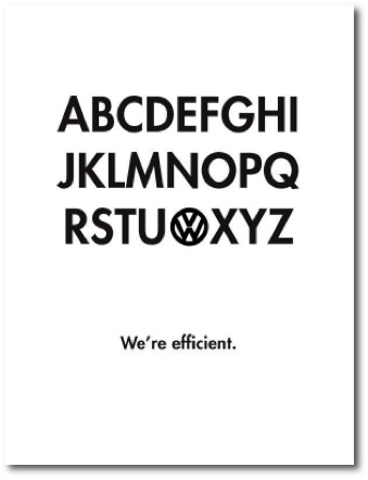
SIMPLY BRILLIANT…

…and brilliantly simple.

The sort of work that demonstrates less is indeed more.

Bravo.

Layout 2 1