Categories
Case Study Work

SWEET.

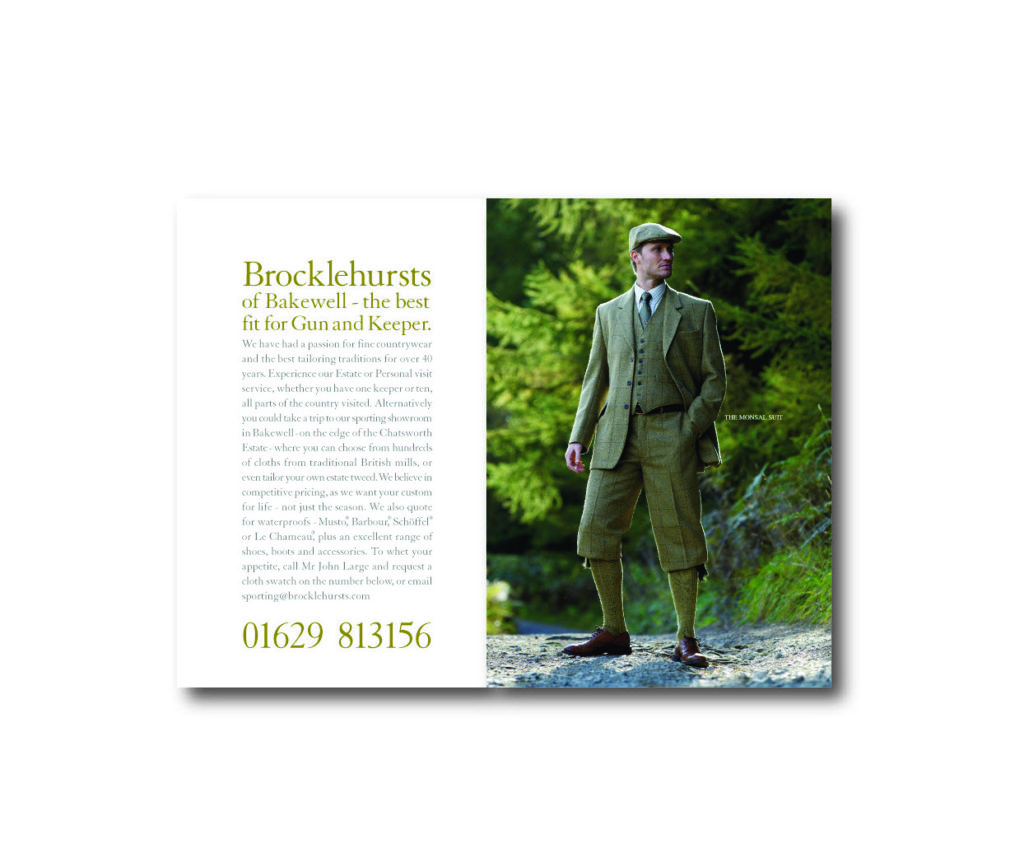
Lou Lou’s began life at a supermarket checkout, with a mum being nagged for a treat. Like a million mums before her, she thought someone should make sweets that are actually good for kids…

An experienced food industry professional, Louise Carr-Smith has spent much of her work life in development kitchens, creating brilliant new products. As a mum, she’s spent much of her home life making sure her kids eat properly.

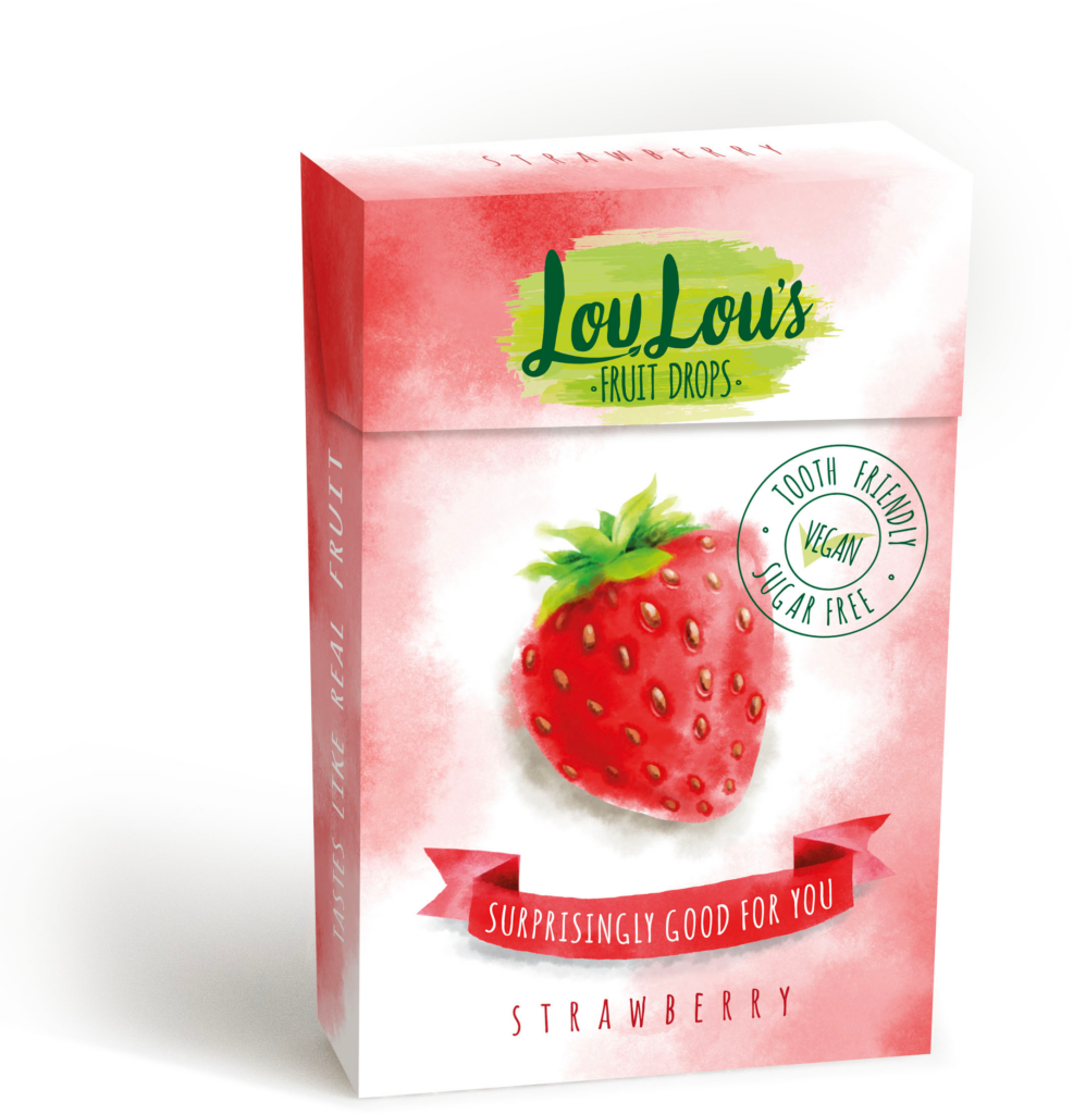
She went to work. They had to use the best ingredients. Real fruit, nothing artificial. They also had to be really good for you. And most importantly, they had to be lip-smackingly, mind-blowingly delicious.

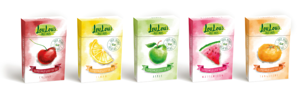
After tweaking, testing and market research, Lou Lou’s was born! Our job was to make the packaging look as good on the eyes as the product is in the eating. After all, kids deserve the best. And parents deserve a break.

Categories
Case Study

The finest clothing in the country

Over the years we turned Brocklehurst’s of Bakewell from a provincial sporting goods shop to a highly respected six figure business with mail order and online shopping.

We significantly upgraded the photography and design along the way, shooting in locations up and down the country, including the beautiful Chatsworth in Derbyshire.

Using a mix of models and real sportsmen added to the authenticity.
We photographed on Grouse moors, country estates and some of the most characterful locations in England.

No birds, animals or bank balances were hurt on our shoots…

Categories
Case Study

53 Degrees North Case Study


53NorthLime_OL


CaseStudy 1

We were asked to develop a sustainable label design for a new craft beer brand based on the client’s initial idea, with the aim of standing out in crowded supermarket beer aisles and giving the brand an established feel. The range of beers all have a hoppy American craft beer style which has risen in popularity in the UK over the last few years. We took the client’s initial concept based on the phonetic alphabet and developed it into a cleaner, more campaignable concept that really brought the brand to life. We researched the phonetic alphabet and paired up a series of 4 names, then developed a distinctive graphic style with quality typography to convey the quality of the beer and help the consumer believe that the product was from a well established brewer. We are currently building a website to help deliver the brand story.

Label design for a new craft beer brand and website xRayZulu

This was the label before we got involved

IWP Communication is a small Manchester Design and Marketing agency specialising in food and drink. Passionate about serving up hard working, great looking work that helps clients engage with their consumers.