An occasional series in which we take a look at wholesaler’s shelves to find examples of design – good, bad and downright UGLY. This time round, we took a trip to our local Booker Cash & Carry.
It’s a fact of life that when you walk into a wholesaler, you’ll be confronted with shelf upon shelf of bland looking cardboard outers and in many cases, pack designs that look like they have ignored the basic rules of good design. It seems that whilst many manufacturers put an awful lot of time and effort into getting their retail pack design right, their trade brands are treated like a poor relation. Often there is little consistency between a company’s retail and food service offerings, leaving (increasingly design savvy) customers struggling to make a connection. It’s something that endlessly perplexes us.
There is another trick that many brands are missing out on too. Why stick with plain boring cardboard outers when you could be using that space to catch the customer’s attention and win sales from impulse purchases? Any creative worth their salt can do this at the drop of their beanie hat. Some brands are taking this opportunity – but not enough in our opinion.
Here are some of the brands we think are doing a good job with their trade pack designs: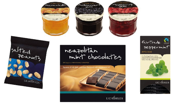
LICHFIELDS – Part of the Booker own label range, Lichfields features hospitality essentials such as tea and coffee, biscuits, yoghurt, individual jam portions,ketchup sachets and fresh juice. Clearly a lot of thought has gone into the pack design which we think does a great job of upselling against premium branded competitors. Compare the packaging and shelf presence of Lichfields’ luxury preserves with that of Robertson’s individual jam portions you can see what we mean:
The pack design for Lichfields’ teas stands good comparison with Twinings and we think that their chocolates compare well to the more upmarket Elizabeth Shaw product.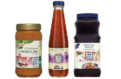
BLUE DRAGON ABF’s oriental food brand Blue Dragon have done a great job of insuring consistent with their retail brand, bringing their recognisable packaging through to their trade offering.
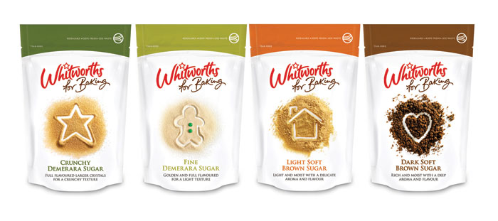 WHITWORTH FOR BAKING Napier Brown commissioned Leahy Brand Design to breathe fresh life into their Whitworth for Baking sugar brand in 2012 and they came up with a fresh, clean, user friendly design that responded directly to customer feedback about mess and storage problems. It’s satisfying to see that they’ve carried all of this good design and innovation through into their bulk packs for food service customers.
The supermarkets have learned their lesson well after poor consumer feedback – having redesigned their ‘value’ product ranges to look more aspirational… Maybe more brands could extend their premium delivery into this important sector?