Categories
Great Work We've Done That Never Got Published

Suppliers – friends with benefits…


Having good relationships with valuable suppliers is something we’ve never underestimated. Alex at Ten Eight Studios is a brilliant shooter (see above), who liked the look of his local caff so much he decided to turn some of the lovely food into tasty images.

We went on to design a series of postcards, planning to distribute them around town. Even though the print costs were reasonable they were never produced. More money for proper sourdough though…

So keeping on the best terms with valuable suppliers – shooters, printers, production houses etc. is not just good business practice. You never know when you’ll need to call on a favour to help a client with their budget.

So. We’ve got the ideas, we’ve got the skills, we’ve got the supplier relationships – all we need now is you…

Categories
Great Work We've Done That Never Got Published

Great Ad ideas

We LOVE a risotto. And our appetite was whetted when our client Riso Gallo asked us to for some ideas on consumer and trade ads.

Ads one & two were aimed at the consumer – the third for the food service trade. This was to feature a testimonial from a local chef and user of Gallo rice…

Great images are certain to get your attention, and we have some great shooters. And home economists, stylists, copywriters and of course the most important bit – ideas…

The ads never ran in the end. So if you have a product that needs spicing up, give us a call – we’ve got the ads – and the appetite.

http://www.iwp.co.uk/work/trade?r2

Categories
Work

Keane on Prawns?

Came across this ad from our archive recently.

Former Manchester United captain Roy Keane famously criticised the prawn sandwich brigade at Old Trafford back in 2000. Just so happened that the prawns in question came from our client, Royal Greenland.

So faster than a Ryan Giggs volley we served up a quick food service ad on the back of the story. Off we went to Old Trafford where the catering team prepared what was admittedly a fairly exotic sandwich for the shoot. Client loved the ad, distributor enquiries peaked, and the art director (me) got the sandwich. Result!

http://www.iwp.co.uk/work/trade?r2

Categories
Work

Unique & Sublime

In Gin Label Design, good things come in small packages. Certainly true for the unique & sublime 5cl Hunters Cheshire Gin miniature. Along with the 20cl, 70cl and 1l bottles, plus a 1l optic version the set is complete.

Hunters Cheshire Gin is made to a 300 year old recipe, and features apples from historic Norton Priory Garden’s ancient orchard in leafy Cheshire. A clever fusion of the highest quality botanicals available and export strength alcohol…

See more at http://www.huntersgin.com

https://blog.iwp.co.uk/mixing-with-the-best/

Categories
Work

Original and best

Nice little Ad we’ve done for Original Montgomery Duffle Coats, designed to direct anyone feeling the chill autumn winds to buy from the website.

Original Montgomery is the oldest surviving company and was chosen by the British Admiralty in the early 1890`s to make the first duffle coats. The duffle was designed to keep out the worst of weather whilst not restricting the movement of sailors.

They were made Initially For the Royal Navy but were ‘traded’ between officers from the Army and later the Royal Flying Corps. As a result by WWll the duffles were made for all allied services.

The first raiders behind enemy lines, the long range desert group later to become the SAS, used duffles as cover for the cold nights and seat cushions for the days travelling many hundreds of miles across the deserts of North Africa.

Now adopted by hipsters from Hoxton to Harrogate, and pretty much following the original design, the classic lives on…

Categories
Things we like

IWP Font Of The Week

IHOF Ambient – Clean and simple sans with a pleasing embellishment. Has a flavour of the influential LETRAGRAPHICA fonts (more of this in a future blog).

Letragraphica

These fonts were brought out in the mid 70’s by Derek Birdsall, Roger Excoffon, Colin Forbes, Armin Hofmann, Herb Lubalin, Marcello Minale and Lou Dorfsman – top design gurus at the time. This went some way towards satisfying the desire for more expressive letterforms by designers keen to exercise their creative flair…

Categories
Work

Beer design – Roll With It

Here’s the latest beer design work for The Mobberley Brewhouse. This one is a collaboration with hop merchant Charles Faram. New varieties of hops are constantly being developed by the grower, increasing the options for ever more creative brewing.

In today’s graphically dizzying display on the beer shelves, this white can range really stands out. We love the simplicity and classic type, plus the lovely line illustration…

English only hops

This one features English only hops – an attempt to produce one of their typically juicy progressive IPA’s, and put the spotlight on English hop varieties. Olicana, Jester, Godiva and the imaginatively named CF160. Don’t know about that – but at an impressive 6.5% ABV we do know it tastes marvellous…

Just Roll With It..!


What the can says:

GROWER OWNED, HOP MERCHANTS FOR MORE THAN 150 YEARS, CHARLES FARAM SOURCE HOPS FROM AROUND THE WORLD, OFFERING BREWERS BOUNDLESS CHOICE AND FLEXIBILITY WITH EVERY BEER THEY MAKE. THEIR OWN HOP BREEDING PROGRAMME CONTINUES TO INCREASE OUR OPTIONS; WITH NEW VARIETIES OF PROGRESSIVE, ENGLISH HOPS BEING REGULARLY RELEASED.

WE USUALLY FOCUS HEAVILY ON AMERICAN VARIETIES, SO THE CHARLES FARAM TEAM AND OURSELVES THOUGHT IT A GREAT IDEA TO PUT SOME OF ENGLANDS FINEST TO THE TEST – AN ATTEMPT TO PRODUCE ONE OF OUR TYPICAL JUICY IPA’S, WITH ENGLISH ONLY HOPS.


Categories
Work

Beer design & photography: The Mobberley Brewhouse

Just had photography done recently for our lovely friends at The Mobberley Brewhouse. Such a lovely part of our beer design work we thought we’d share. It’s a small batch exclusive – a very drinkable New England Session IPA at 4.4% abv, with juicy hop flavours from Citra and Mosaic hops.

You can see more of our design work for TMB here: http://mobberleybrewhouse.co.uk

The Mobberley Brewhouse specialises in dangerously good beer, from delicately brewed session beers, to outrageous modern craft beers. They all leave the brewery crammed full of unique flavour. Obsessed with improvement, it is their constant aim to produce the best and most consistent beer possible.

Having sampled pretty much all of their extensive range (in the line of duty of course), we can only agree.

Photography by shooter Alex at Ten Eight: https://www.teneightstudios.co.uk/

Cheers!

Categories
Work

Hunter’s Cheshire Gin – mixing with the best

Photography Shoot for Gin and Cocktails all made with Hunters Gin


Probably the first gin cocktail invented was a simple mix of gin and Angostura Bitters. Credited to the captain and surgeon of the HMS Hercules in the early 1800s, while patrolling the Caribbean (no wonder they kept getting lost). Then followed the still-popular Pimms in the middle of the 19th century. This time period also saw Gin first mixed with lime, as a way to help combat the threat of scurvy in sailors.

In 1874, the first Tom Collins was served in London, still a popular item in any London cocktail bar – soon followed by the dry martini. Early in the 1900s saw the first Singapore Sling and the Negroni – those old fashioned gin cocktails have truly stood the test of time…

The shoot

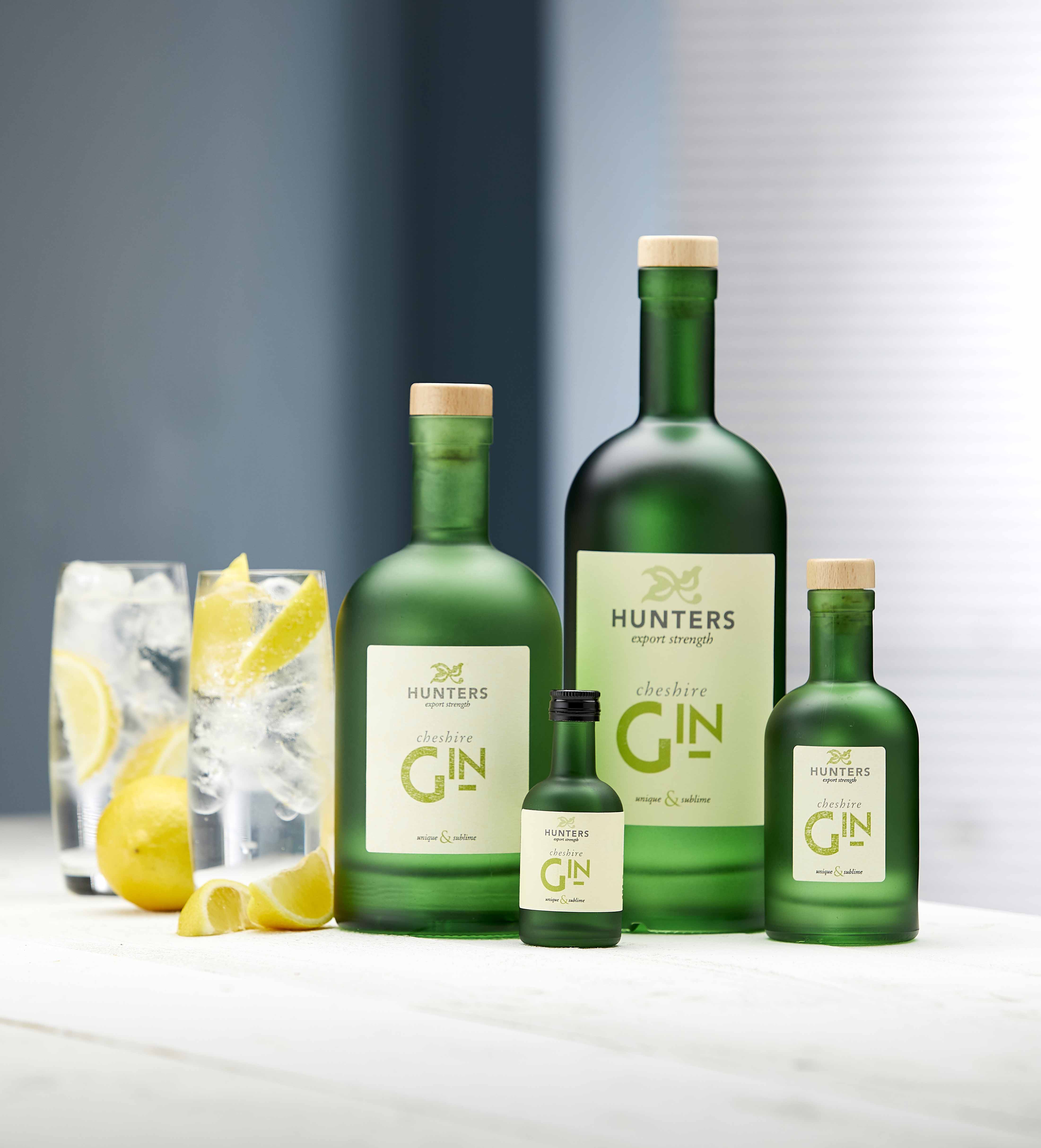
We recently did a shoot for our delightful client (of course ALL clients are delightful – no?), Hunter’s Cheshire gin.

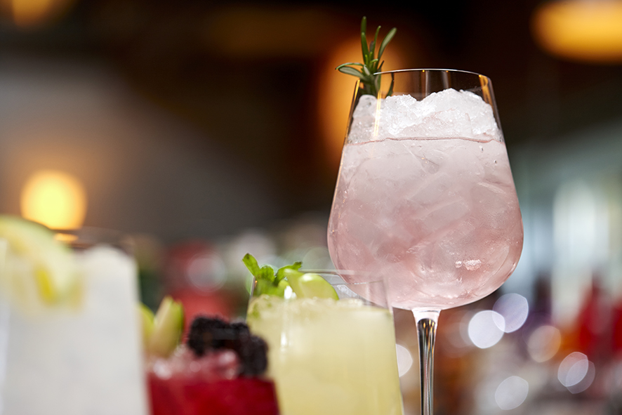
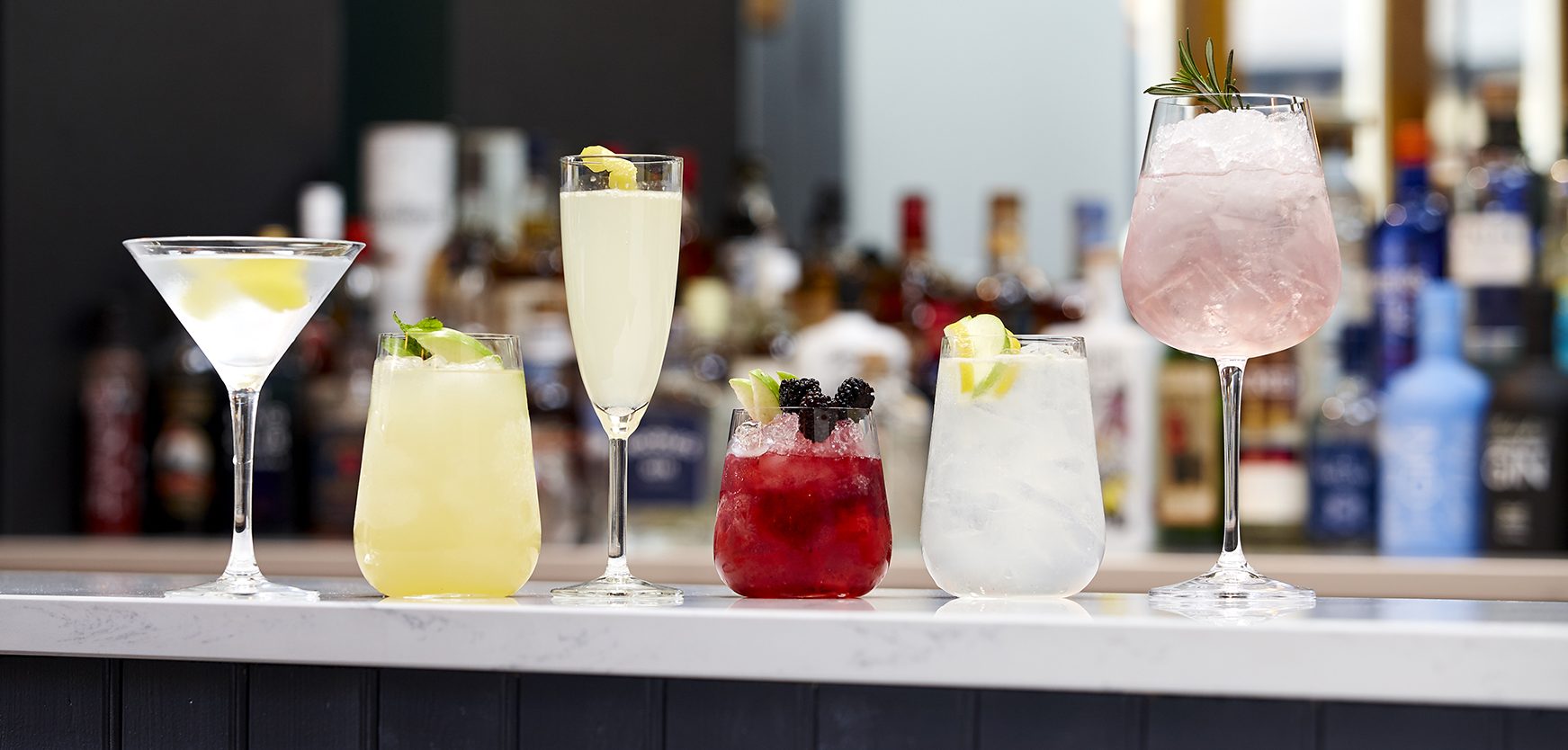
Six delicious cocktails showing off the qualities of the gin. Among other botanicals, Hunter’s contains Cheshire apples from historic Norton Priory garden’s own orchard. It’s this clever twist that gives Hunter’s premium export strength gin a spicy fruity edge.

The unique flavour comes from the botanicals – including punchy, piney juniper from the Balkans, French angelica, Cinnamon bark from Madagascar, musky, nutty angelica root from France, ribbons of Spanish lemon peel and Florentine orris root.

Hunters is a premium gin placed among the top division of world-renowned gins.

Careful who you mix with…

Created by Hunter’s talented mixologist Louis, the Hunter’s cocktails were designed to deliver the special taste of their gin. It’s a single batch distillation from a 300 year old recipe.

We shot six – Truly Hunters, Mr Hunter and Mr FitzPatrick, Hunters Cheshire Champagne, Tom Collins, Hunters Apple Bramble and a Hunters Gin Martini.

And no, the Art Director didn’t get to drink them (that’s what HE said)…

Categories
Comment Things we like

IWP Font Of The Week


Classic, elegant and expensive looking…IWP font of the week 3

This is what lovely Wikipedia has to say…

 Didot is a group of typefaces named after the famous French printing and type producing Didot family.[1] The classification is known as modern, or Didone.

Didot’s type in the Code civil des Français, printed by the company of Firmin Didot in 1804.

The most famous Didot typefaces were developed in the period 1784–1811. Firmin Didot (1764–1836) cut the letters, and cast them as type in Paris. His brother, Pierre Didot (1760–1853) used the types in printing. His edition of La Henriade by Voltaire in 1818 is considered his masterwork. The typeface takes inspiration from John Baskerville’s experimentation with increasing stroke contrast and a more condensed armature. The Didot family’s development of a high contrast typeface with an increased stress is contemporary to similar faces developed by Giambattista Bodoni in Italy.

Didot is described as neoclassical, and evocative of the Age of Enlightenment. The Didot family were among the first to set up a printing press in the newly independent Greece, and typefaces in the style of Didot have remained popular in Greek since.

The Style Network used a bold weight of Didot in its on-air identity (in addition to the News Gothic font). Alexey Brodovitch implemented the usage of Didot in Cahiers d’Art and Harper’s Bazaar. Vogue has been using Didot as the typeface for their cover title since 1955.

A survey of 368 people done by writer and typographer Sarah Hyndman suggested that bold typefaces with rounder terminals appear cheaper, whereas lighter weights, serifs, and contrasts were rated as more expensive, with the modern Didot selected as the most expensive looking font.

The “CBS Didot” version of Didot was commissioned and used by broadcast network CBS for many years alongside its famous “eye” logo. While the network’s use of Didot with its logo is not as prevalent as it once was, it is still a common sight, used mainly for the imaging of CBS News, the logo for CBS Corporation, and the logotype for The Late Show with Stephen Colbert. It is also used as the logotype for the credits of the CBS sitcom “Mom.”